个人主页已经很久没有更新了,去年把博客迁移到 Hugo 之后,就一直想把个人主页也用 Hugo 重新搭建并简化,并稍微详细的记录一下整个搭建的过程。
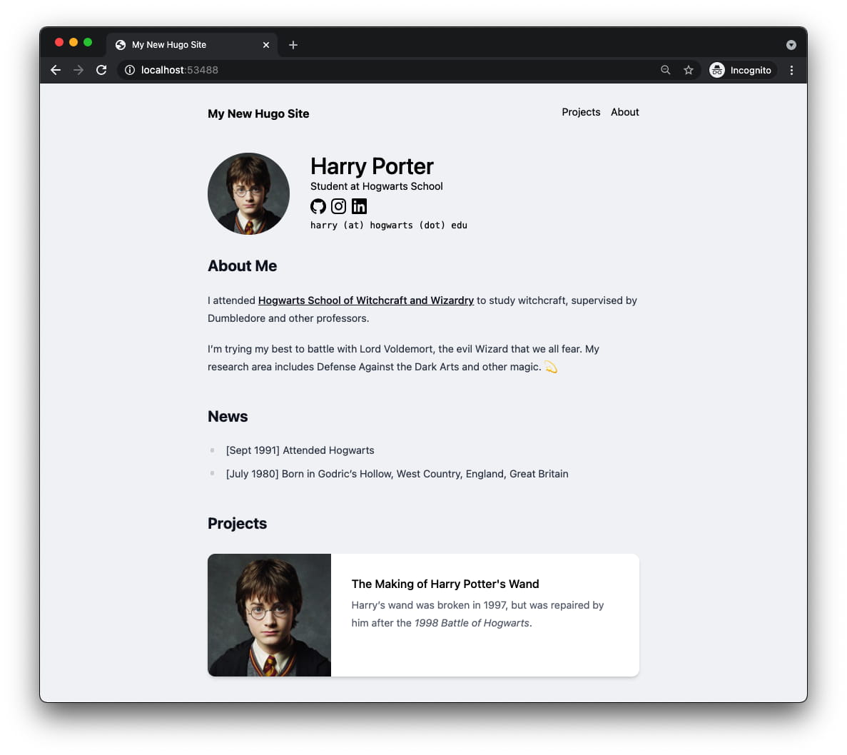
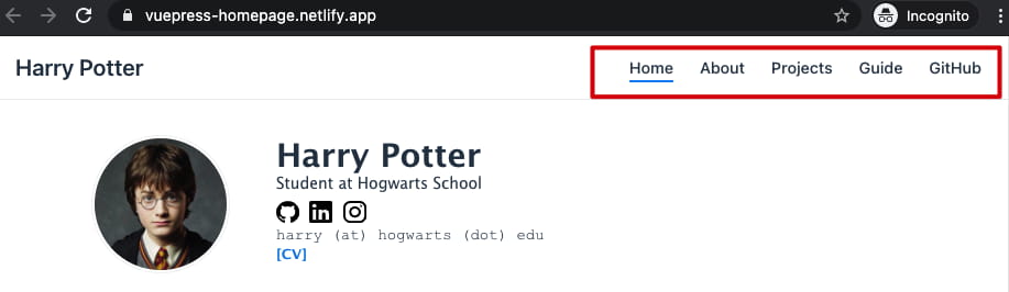
如果能够跟着我的记录一步步做的话,完成之后可以得到下面的效果:
主要用到的工具是 Hugo + Tailwind CSS:
Windows 用户推荐通过 Chocolatey 来安装所需的工具,macOS 用户则可以用 Homebrew 安装。关于 Chocolatey,更多可以参考这篇文章 。
需要安装 Hugo 和 Node.js :
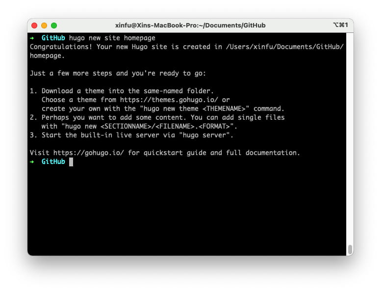
Windows:$ choco install hugo nodejs macOS:$ brew install hugo node 首先,需要用 Hugo 新建一个新的空白站点,打开 Powershell 或 Terminal:
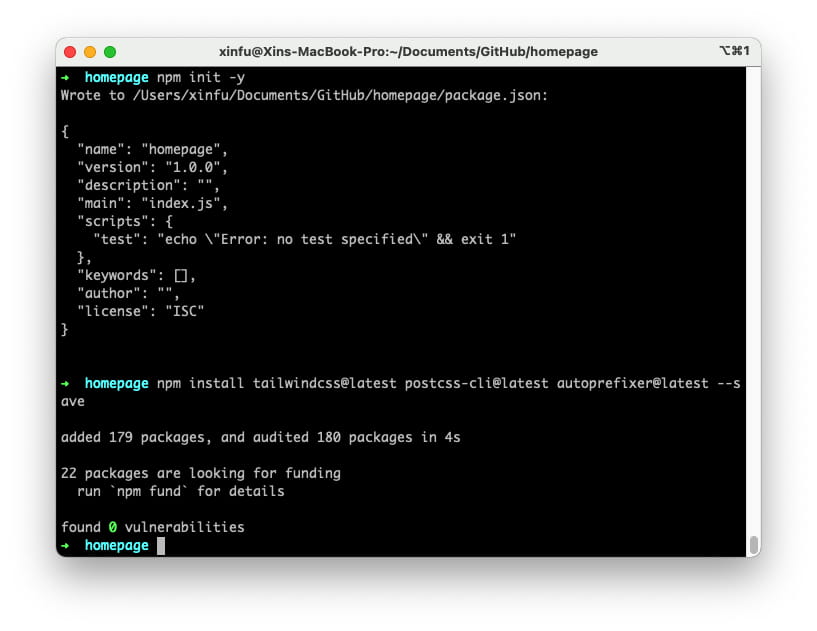
按照提示会生成一个新的目录 homepage,接下来要在刚刚的目录里面初始化 npm 以及安装一些必要的包:
1
2
3
cd homepage
npm init -y
npm install tailwindcss@latest postcss-cli@latest autoprefixer@latest --save
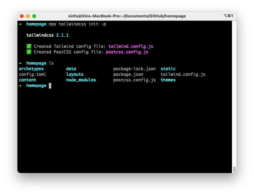
之后初始化 Tailwind:
1
npx tailwindcss init -p
这个命令会创建 tailwind.config.js 和 postcss.config.js,从名字上可以判断它们是配置文件
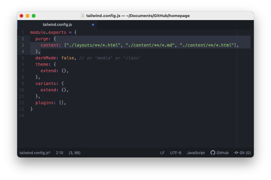
打开 tailwind.config.js,修改 purge 部分为:
1
2
3
purge : {
content : [ "./layouts/**/*.html" , "./content/**/*.md" , "./content/**/*.html" ],
},
接着来做一个简单的 Hello Hugo 的网站。运行下面的命令,为的是在 Hugo 项目中新建一些基本的目录和站点文件:
1
2
mkdir -p assets/css layouts/_default
touch layouts/index.html layouts/_default/baseof.html assets/css/main.css
主要创建了 layouts 目录以及基本的页面结构:
layouts
├── _default
│   └── baseof.html
└── index.html
在这个目录里面,baseof.html 是基本的框架,index.html 是主页的构架。
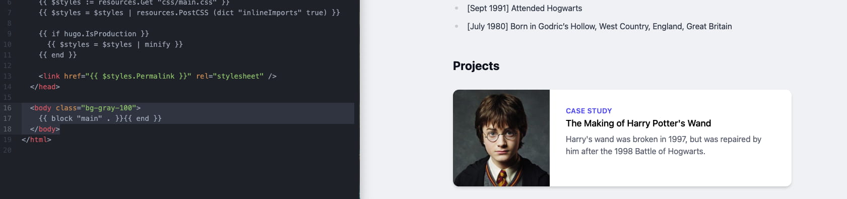
先在 layouts/_default/baseof.html 里添加:
 1
 2
 3
 4
 5
 6
 7
 8
 9
10
11
12
13
14
15
16
17
18
19
20
21
<!DOCTYPE html>
< html >
< head >
< title > {{ .Site.Title }}</ title >
< meta name = "viewport" content = "width=device-width, initial-scale=1, maximum-scale=1" >
{{ $styles := resources.Get "css/main.css" }}
{{ $styles = $styles | resources.PostCSS (dict "inlineImports" true) }}
{{ if hugo.IsProduction }}
{{ $styles = $styles | minify }}
{{ end }}
< link href = "{{ $styles.Permalink }}" rel = "stylesheet" />
</ head >
< body >
{{ block "main" . }}{{ end }}
</ body >
</ html >
之后在 layouts/index.html 添加:
1
2
3
{{ define "main" }}
< h1 class = "container mx-auto mt-5 text-3xl" > Hello Hugo</ h1 >
{{ end }}
最后在 assets/css/main.css 中添上:
1
2
3
@ tailwind base ;
@ tailwind components ;
@ tailwind utilities ;
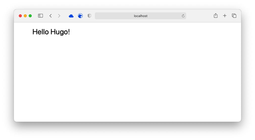
在终端里运行 hugo server 看看效果
接下来看看如何构建一个页面,大致上将页面划分为两个主要部分,最上面是头部的导航栏,其余的内容放在另一个大的容器内
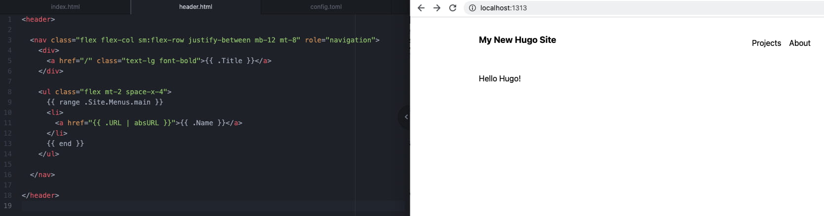
给刚刚新建的页面加个导航栏,新建 layouts/partials 文件夹,这个目录里面之后会放一些小的部件。新建 layout/partials/header.html:
1
2
3
4
5
6
7
8
9
< header >
< nav class = "flex flex-col sm:flex-row justify-between mb-12 mt-8" role = "navigation" >
< div >
< a href = "/" class = "text-lg font-bold" > {{ .Site.Title }}</ a >
</ div >
</ nav >
</ header >
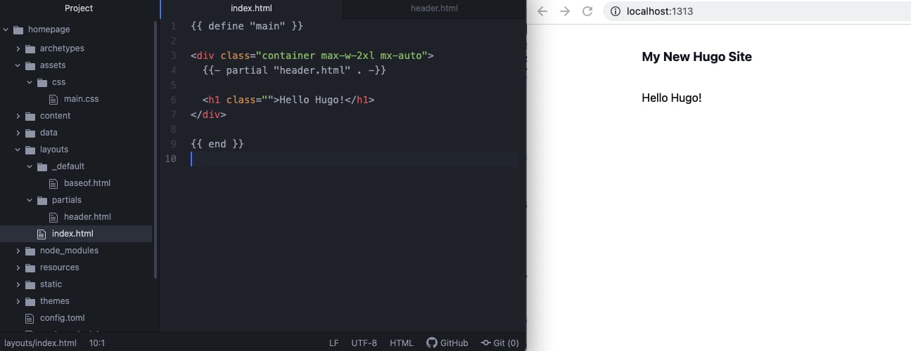
上面主要添加了一个大的可点击的标题,内容为站点 config.toml 中的 title 属性。在 index.html 中通过 Hugo 的 partial 关键词插入 header.html 的内容:
1
2
3
4
5
6
7
8
9
{{ define "main" }}
< div class = "container max-w-2xl mx-auto" >
{{- partial "header.html" . -}}
< h1 class = "" > Hello Hugo!</ h1 >
</ div >
{{ end }}
之后要实现导航栏右侧的几个按钮,它们本质上是横向的列表。
修改刚刚的 header.html :
 1
 2
 3
 4
 5
 6
 7
 8
 9
10
11
12
13
14
15
16
17
18
< header >
< nav class = "flex flex-col sm:flex-row justify-between mb-12 mt-8" role = "navigation" >
< div >
< a href = "/" class = "text-lg font-bold" > {{ .Site.Title }}</ a >
</ div >
< ul class = "flex space-x-4" >
{{ range .Site.Menus.main }}
< li >
< a href = "{{ .URL | absURL }}" > {{ .Name }}</ a >
</ li >
{{ end }}
</ ul >
</ nav >
</ header >
{{ range .Site.Menus.main }} 会在 config.toml 中查找 [menu] 配置。在 config.toml 中,添加一些配置:
 1
 2
 3
 4
 5
 6
 7
 8
 9
10
11
# 顶部菜单
[ menu ]
[[ menu . main ]]
url = "/projects"
name = "Projects"
weight = 1
[[ menu . main ]]
url = "/about"
name = "About"
weight = 2
我们的导航栏基本就完成了,之后只需要更改配置文件即可添加其他的页面链接。
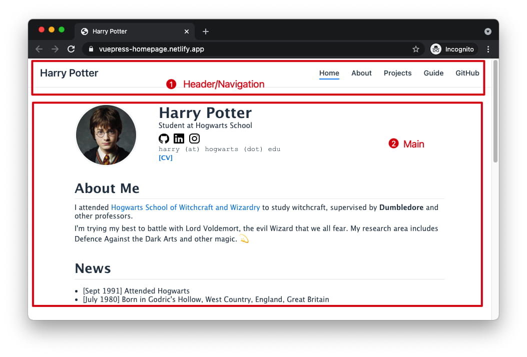
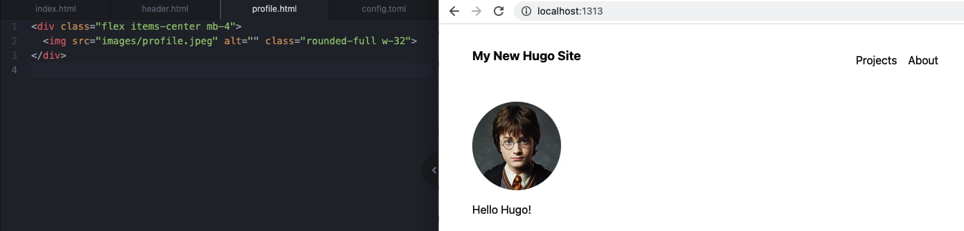
接下来制作最上面的这样一个简介的组件,包括了照片、名字、社交网站链接等元素
把 profile.jpeg 照片放到 static/images 里面,在 layouts/partials下创建 profile.html:
1
2
3
< div class = "flex mb-4" >
< img src = "images/profile.jpeg" alt = "" class = "rounded-full object-cover w-32 mr-8" >
</ div >
像引入 header.html 一样,在 index.html 引入:
 1
 2
 3
 4
 5
 6
 7
 8
 9
10
{{ define "main" }}
< div class = "container max-w-2xl mx-auto" >
{{- partial "header.html" . -}}
{{- partial "profile.html" . -}}
< h1 class = "" > Hello Hugo!</ h1 >
</ div >
{{ end }}
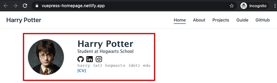
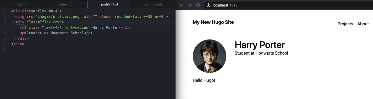
之后加入右边的部分,需要用一个 div 容器,里面加入 Harry Porter 的标题和下面的简介:
1
2
3
4
5
6
7
< div class = "flex mb-4" >
< img src = "images/profile.jpeg" alt = "" class = "rounded-full w-32 h-32 mr-8" >
< div class = "flex-row" >
< h1 class = "text-4xl font-medium" > Harry Porter</ h1 >
< p > Student at Hogwarts School</ p >
</ div >
</ div >
之后需要加入一些社交网站的图标,例如 GitHub、LinkedIn、Twitter 等。首先需要找到想要添加网站的 SVG 矢量图标,可以利用 Simple Icons 或者 Flaticon :
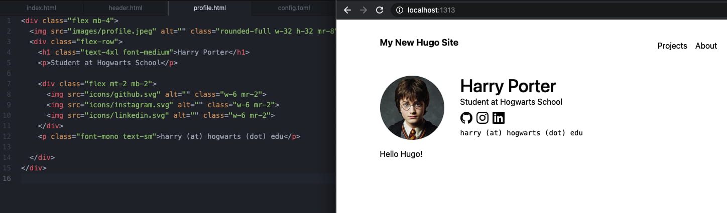
同样,和添加头像步骤一样,新建一个 static/icons 目录,并将下载的 github.svg 等图标放进去,再修改 profile.html:
 1
 2
 3
 4
 5
 6
 7
 8
 9
10
11
12
13
14
15
< div class = "flex mb-4" >
< img src = "images/profile.jpeg" alt = "" class = "rounded-full w-32 h-32 mr-8" >
< div class = "flex-row" >
< h1 class = "text-4xl font-medium" > Harry Porter</ h1 >
< p > Student at Hogwarts School</ p >
< div class = "flex mt-2 mb-2" >
< img src = "icons/github.svg" alt = "" class = "w-6 mr-2" >
< img src = "icons/instagram.svg" alt = "" class = "w-6 mr-2" >
< img src = "icons/linkedin.svg" alt = "" class = "w-6 mr-2" >
</ div >
< p class = "font-mono text-sm" > harry (at) hogwarts (dot) edu</ p >
</ div >
</ div >
效果:
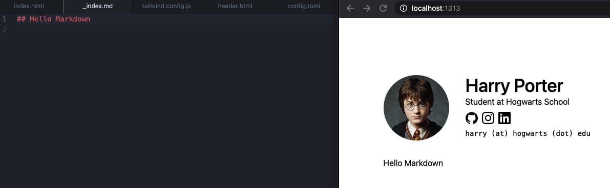
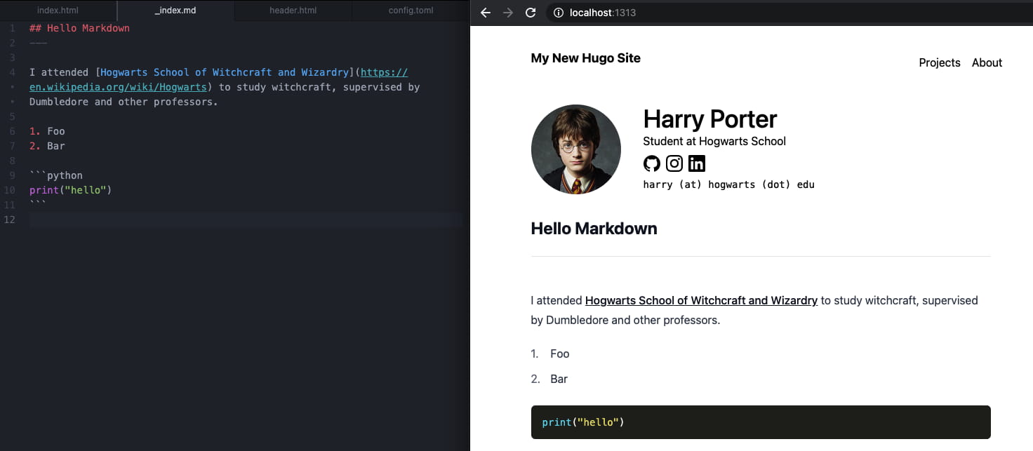
在完成了这一部分之后,接下来我们需要让主页的主体部分(也就是上面的 Hello Hugo!)部分能够显示 Markdown 文件的内容。我们需要创建 content/_index.md 文件,在里面加入任意内容,如 ## Hello Markdown,修改 layouts/index.html,加入 {{ .Content }},这部分将会被替换成 Markdown 渲染后的内容
1
2
3
4
5
6
...
  {{- partial "header.html" . -}}
  {{- partial "profile.html" . -}}

  {{ .Content }}
...
但是... 实际并没有把刚刚 content/_index.md 中的标题正确的格式渲染出来
这是因为 Tailwind CSS 默认是把这种标题的格式去掉了,要想重新给标题加上格式,需要额外的步骤。在搜索了一番之后,在官方文档里发现了 Typography 的插件。为了能够用这个插件,需要先安装:
1
npm install @tailwindcss/typography
之后在 tailwind.config.js 加入:
1
2
3
4
5
6
module . exports = {
...
plugins : [
require ( '@tailwindcss/typography' ),
],
}
之后修改 layouts/index.html,给 {{ .Content }} 用 article 标签包裹,并加上 prose class:
1
2
3
4
5
6
7
8
...
{{- partial "header.html" . -}}
{{- partial "profile.html" . -}}
< article class = "prose" >
{{ .Content }}
</ article >
...
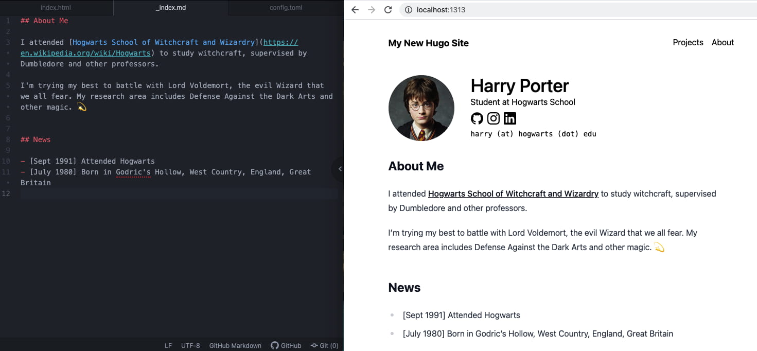
到这一步就基本只需要修改 _index.md 就可以添加原来 90% 主页的内容了:
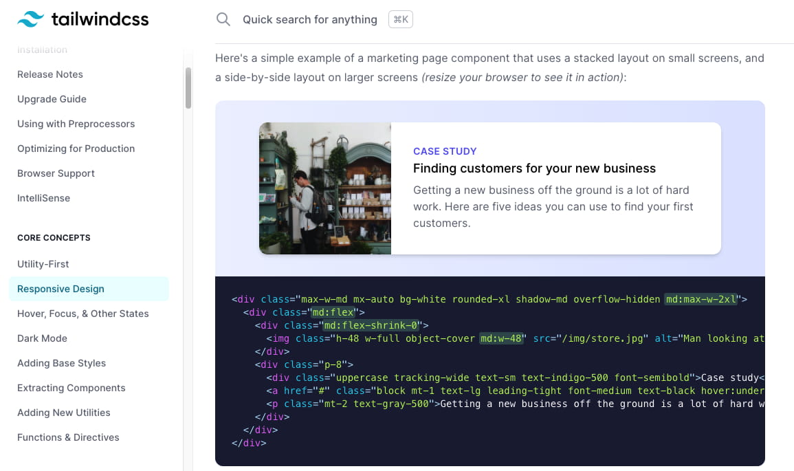
接下来尝试加入更复杂一些的组件,例如 Tailwind 文档演示的这个卡片 :
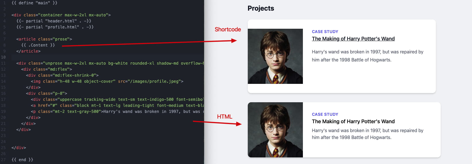
稍作修改,尝试把这一段加入到 index.html 里刚刚添加的 <article> 之后:
 1
 2
 3
 4
 5
 6
 7
 8
 9
10
11
12
13
14
15
16
17
...
</ article >
< div class = "max-w-2xl mx-auto bg-white rounded-xl shadow-md overflow-hidden my-8" >
< div class = "md:flex" >
< div class = "md:flex-shrink-0" >
< img class = "h-48 w-48 object-cover" src = "/images/profile.jpeg" >
</ div >
< div class = "p-8" >
< div class = "uppercase tracking-wide text-sm text-indigo-500 font-semibold" > Case study</ div >
< a href = "#" class = "block mt-1 text-lg leading-tight font-medium text-black hover:underline" > The Making of Harry Potter's Wand</ a >
< p class = "mt-2 text-gray-500" > Harry's wand was broken in 1997, but was repaired by him after the 1998 Battle of Hogwarts. </ p >
</ div >
</ div >
</ div >
...
效果还可以,只是白色的背景和卡片的背景融为了一体
为了更好的区分,一种方法是在layouts/_default/baseof.html 给 <body> 加上浅灰的背景色:
1
2
3
...
< body class = "bg-gray-100" >
...
但如果我们想添加若干个上面的卡片的话,就需要将那一大段代码复制若干遍,并且将来想要修改这个卡片的样式,也需要一个一个修改。
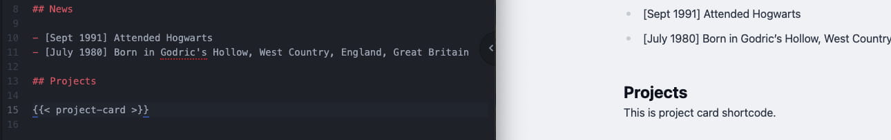
这时候我考虑将卡片提取成组件,每次用的时候只需要提供图片路径、标题文字和介绍文字。可以利用 Hugo 的 Shortcodes 实现这一点。创建 layouts/shortcodes/project-card.html 文件,先添加简单的一行:
1
This is project card shortcode.
在 content/_index.md 中使用上面的 Shortcode:
1
2
3
4
...
## Projects
< project-card > }}
可以看到右边对应的地方出现了 project-card.html 里的内容
之后把上面的卡片代码复制到 layouts/shortcodes/project-card.html
结果发现在不一样的地方显示的卡片效果不一样。导致这个问题的原因是之前引入用来渲染 Markdown 的 @tailwind/typography 的 prose 类给这个卡片添加了一些额外的样式,造成文字、图片的边距不太一样了。在这里 找到了问题的解决方法,修改 tailwind.config.js:
1
2
3
4
module . exports = {
important : "html" ,
purge : {
...
在 layouts/index.html 中,给 article 添加 max-w-none 样式来取消最大宽度的限制,这样卡片就能填充满整个横向的空间:
1
2
3
< article class = "prose max-w-none" >
{{ .Content }}
</ article >
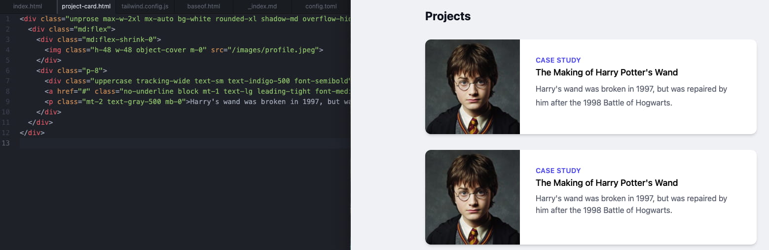
之后在 project-card.html 中的 img 上增添 m-0 属性,表示外边距为 0,在最后的 p 元素加上 mb-0 将底部边距设为 0,给 a 元素添上 no-underline 来取消下划线效果
1
2
3
4
5
6
...
< img class = "h-48 w-48 object-cover m-0" src = "/images/profile.jpeg" >
...
< a href = "#" class = "block mt-1 text-lg leading-tight font-medium text-black hover:underline" > The Making of Harry Potter's Wand</ a >
< p class = "mt-2 text-gray-500 mb-0" > Harry's wand was broken in 1997, but was repaired by him after the 1998 Battle of Hogwarts. </ p >
...
删除 layouts/index.html 中的卡片部分。接着修改 Shortcode 的模板,让不同的部分能够通过参数来修改。
参照官方文档的这个例子 ,修改 img 标签的 src 部分为 {{ .Get "img" }},花括号的部分会被替换为 {{< project-card img="xxx" >}} 中的 xxx
1
2
3
...
< img class = "h-48 w-48 object-cover m-0" src = "{{.Get " img " }}" >
...
修改 content/_index.md 中的 Shortcode 为:
1
{{< project-card img = "images/profile.jpeg" > }}
保存之后应该会看到正确显示的图片。接着修改 layouts/shortcodes/project-card.html,去掉 Case Study 那一行(没啥用),将 a 中的内容改为 {{ .Get "title" | absURL }},将 p 改为 div 并改标签内容为 {{ .Inner | markdownify }} 来展示 Markdown 内容
 1
 2
 3
 4
 5
 6
 7
 8
 9
10
11
< div class = "max-w-2xl mx-auto bg-white rounded-xl shadow-md overflow-hidden my-8" >
< div class = "md:flex" >
< div class = "md:flex-shrink-0" >
< img class = "h-48 w-48 object-cover m-0" src = "{{ .Get " img " | absURL }}" >
</ div >
< div class = "p-8" >
< a href = "#" class = "no-underline block mt-1 text-lg leading-tight font-medium text-black hover:underline" > {{ .Get "title" }}</ a >
< div class = "mt-2 text-gray-500 mb-0" > {{ .Inner | markdownify }}</ div >
</ div >
</ div >
</ div >
之后可以在 content/_index.md 中这样使用:
1
2
3
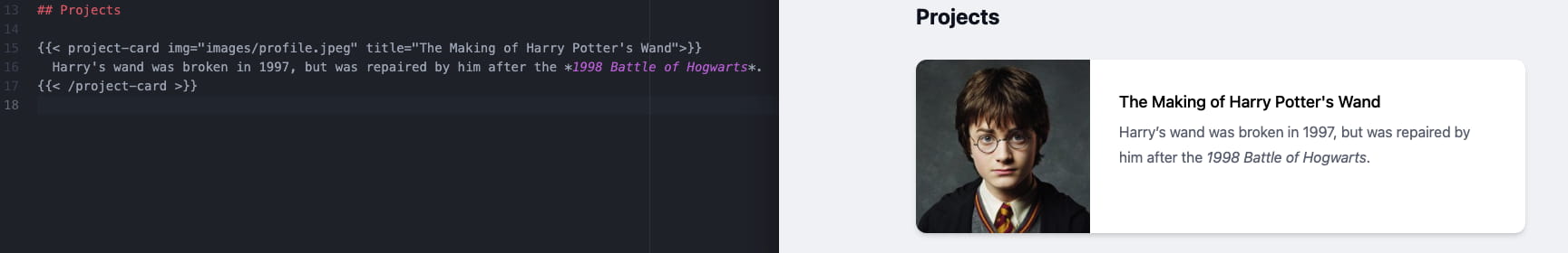
{{< project-card img = "images/profile.jpeg" title = "The Making of Harry Potter's Wand" > }}
Harry's wand was broken in 1997, but was repaired by him after the *1998 Battle of Hogwarts* .
{{< project-card > }}
Nice,中间的文字部分甚至能用 Markdown
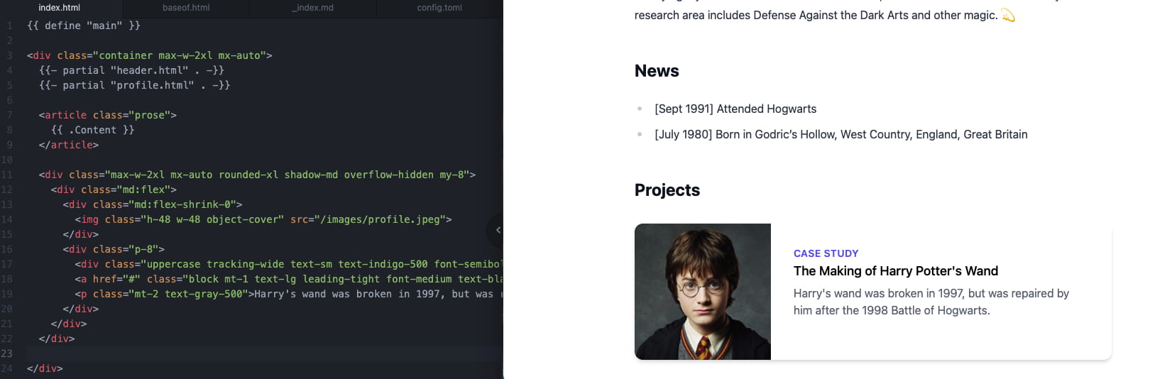
至此就基本完成了个人主页的搭建,之后想要修改主页的话只需修改 _index.md 中的内容。
接着尝试添加 Projects 页面,新建 layouts/projects/list.html 模板文件,将 layouts/index.html 的内容复制过去,去掉 profile 那一行:
 1
 2
 3
 4
 5
 6
 7
 8
 9
10
11
12
{{ define "main" }}
< div class = "container max-w-2xl mx-auto" >
{{- partial "header.html" . -}}
< article class = "prose max-w-none mb-8" >
{{ .Content }}
</ article >
</ div >
{{ end }}
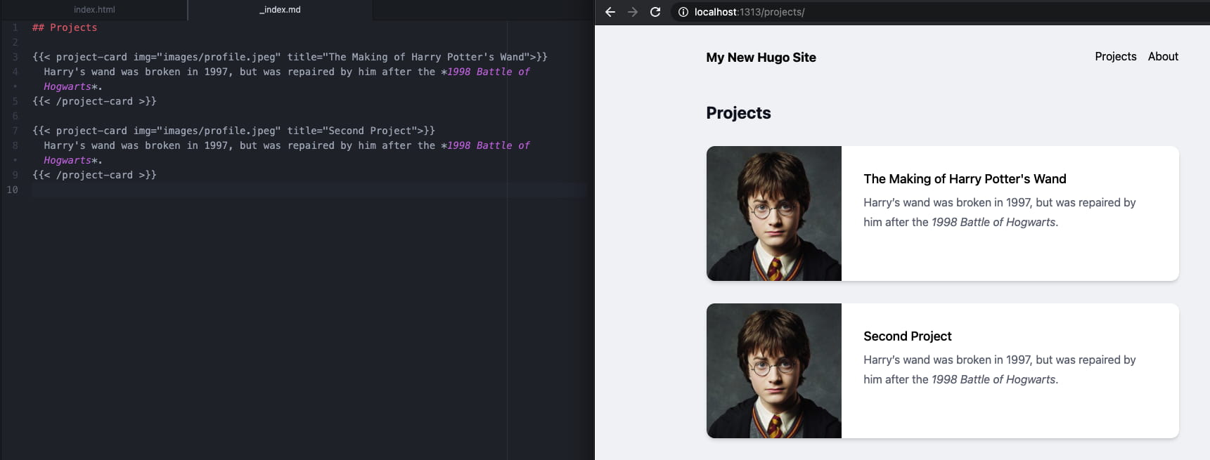
新建 content/projects/_index.md 文件,可以继续利用 project-card 组件:
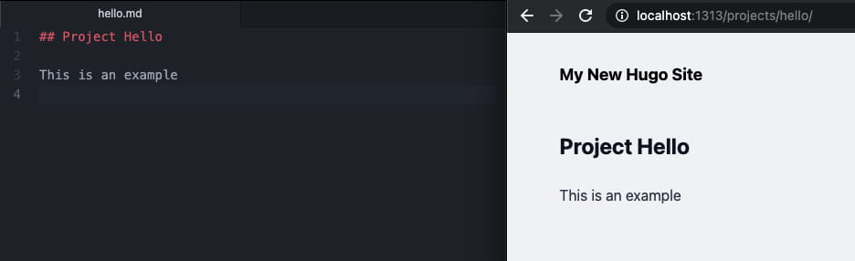
这时候可能你会想给某个项目创建一个页面,用来展示具体的项目细节,点击项目卡片的标题即可进入到这个页面。先创建 layouts/projects/single.html 文件,接着将 layouts/projects/list.html 的内容复制到 single.html 中。创建 content/projects/hello.md,我们将在其中添加一些内容:
1
2
3
## Project Hello
接着访问 localhost:1313/projects/hello/
对于项目卡片,需要修改 Shortcode 模板来增添额外的参数使得点击标题能够跳转到这个页面。修改 project-card.html:
1
2
3
...
< a href = "{{ .Get " url " | absURL }}" class = "no-underline block mt-1 text-lg leading-tight font-medium text-black hover:underline" > {{ .Get "title" }}</ a >
...
在 content/projects/_index.md 中,给其中一个 project-card 添加 url="projects/hello" 即可。
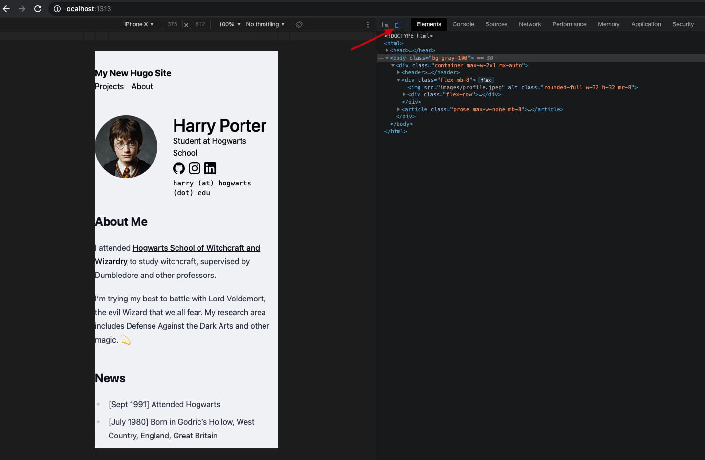
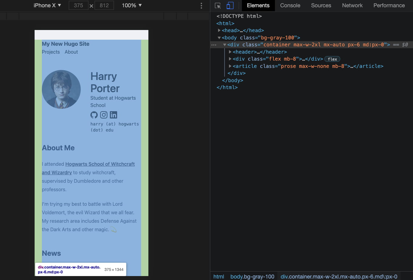
上面的页面在电脑上浏览的效果还不错,来看看在手机这种屏幕比较窄的设备上怎么样,按 F12 打开 Chrome 开发者工具,在左上角切换移动设备:
在 iPhone 上的显示效果大致如上,可以看到主要的问题是页面左右两边内边距没有设置好。通过把鼠标放在右边树状的 HTML 标签上,可以确定需要在 body 下第一个 div 添加 padding:px-6 md:px-0。其中 px-6 表示 X轴方向,也就是左右的 padding 为 6 个单位,后面的 md:px-0 表示在中等尺寸及更大的屏幕上,则设置左右页边距为 0:
1
2
< div class = "container max-w-2xl mx-auto px-6 md:px-0" >
...
项目卡片也需要进一步修改:
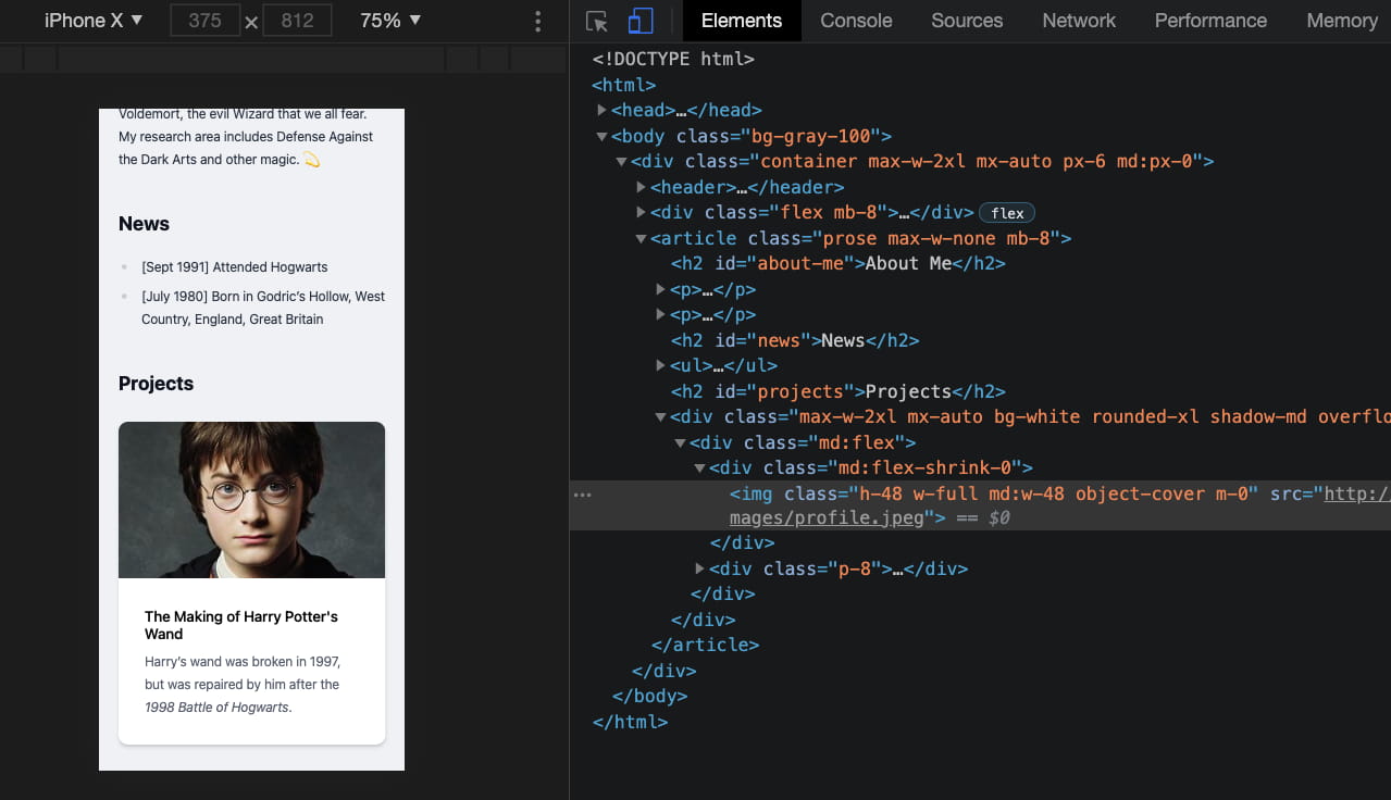
将 layouts/shortcodes/project-card.html 中的 <img> 标签里的 w-48 替换为 w-full md:w-48,表示默认宽度 w(idth) 为 full,也就是填充整个横向部分,在大屏幕宽度则固定为 48 个单位:
这篇文章记录了:
初始化 Hugo 项目及添加 Tailwind CSS 搭建基本的主页结构, 创建单独 Projects 页面 为手机移动端优化页面样式 下一篇文章,将介绍如何进一步优化该网站的内容和样式,以及和如何部署网站。
相关链接 :